Ember
A wood-fired restaurant site that feels like looking into the hearth.
The Challenge
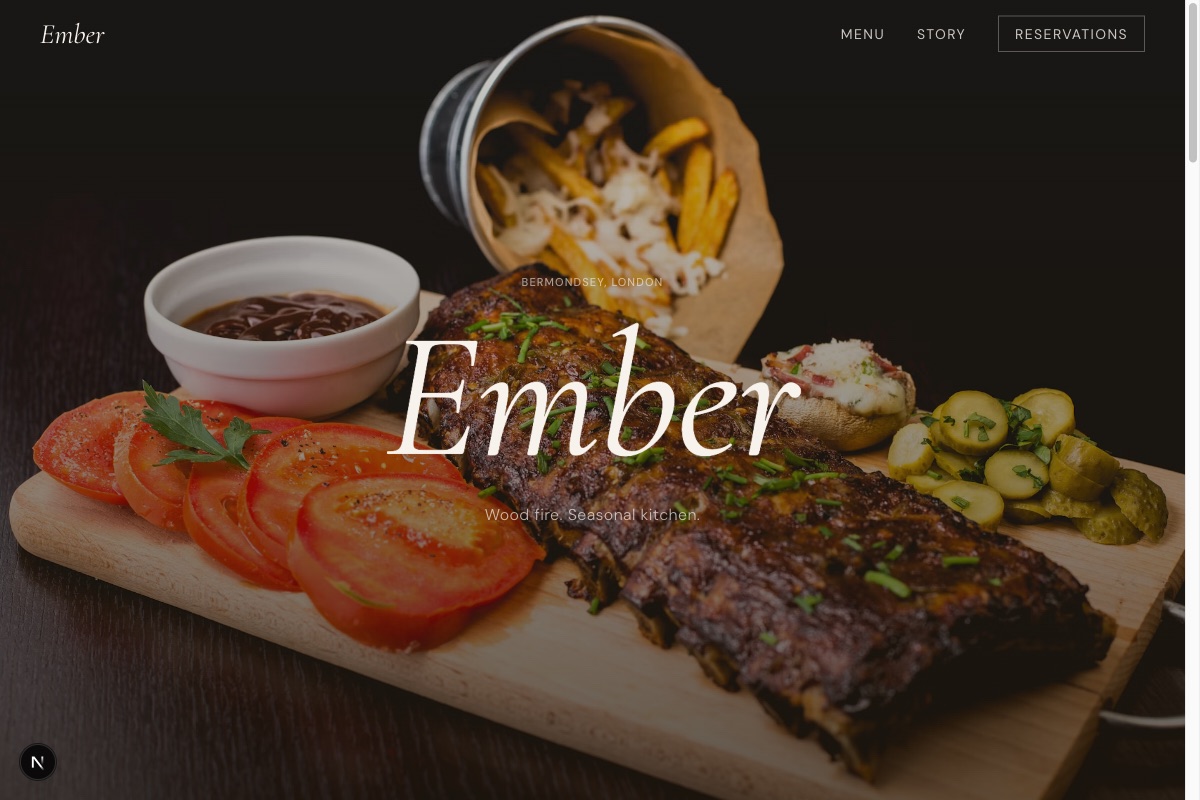
Ember is a 40-cover restaurant in a Bermondsey railway arch where everything passes through a wood-fired hearth. Restaurant websites usually bury the atmosphere under booking widgets and PDF menus — this one needed to carry the feeling of the room: dark, warm, a little theatrical.
The Solution
We opened with fire. The hero is a deep amber-to-charcoal field with the restaurant's name set in Cormorant Garamond italic, drifting on scroll. Below it, three dishes float at three different parallax speeds around a single line of philosophy — the scroll moment that makes people stop.
The menu page is typography all the way down: dish names, clean rules, prices set in a light serif. No photography needed where the words are doing the cooking. A reservations page rounds it out with a simple form, hours, and a 48-hour cancellation policy stated plainly.
Key Features
The floating-dish section drives three images on independent scroll transforms (−20→+40px, +30→−50px, −10→+30px), creating genuine three-plane depth. All motion is GPU-friendly transforms only, and respects reduced-motion preferences throughout.
The palette — cream, charcoal-brown, ember orange — and the Cormorant/DM Sans pairing carry the brand from the hero to the allergen note. The reservation form is ready to wire into Resy or OpenTable when the restaurant is.
Want results like these?
Let's talk about what we can build for your business. No obligation, just a conversation.
Start a project