Helio
A high-craft SaaS landing page for an async standup tool.
The Challenge
SaaS landing pages are a crowded genre with a strong house style — get it slightly wrong and you look like a template. Helio needed the Linear-grade polish buyers expect, plus messaging that actually explains the product: async standups that replace the daily meeting.
The Solution
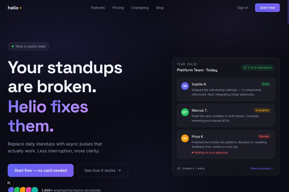
We wrote the page before designing it. Problem/solution sections name the actual pain (interrupted mornings, timezone gaps), the bento grid demonstrates features rather than listing them, and the pricing table makes the free tier genuinely legible.
Visually it's a single dark canvas: midnight blue with an indigo gradient mesh, warm white type, glass cards with animated borders on the CTAs. Testimonials use real names, real roles and real photography — no initials in coloured circles.
Key Features
Scroll-triggered reveals run through the page on a single easing system, and the logo wall, stats and three-tier pricing give the page the full conversion architecture without a single lorem ipsum.
The page is one route and loads fast — no framework bloat beyond what the animations earn. Ready for a product team to bolt a real app behind it.
Want results like these?
Let's talk about what we can build for your business. No obligation, just a conversation.
Start a project