North Studio
A brutalist, type-led site for a brand studio — the typography is the identity.
The Challenge
A brand studio's own site is the hardest brief there is: it has to demonstrate the craft it sells. North Studio needed a portfolio that would win other agencies' clients — opinionated enough to filter for the right ones, structured enough to read as rigour rather than style.
The Solution
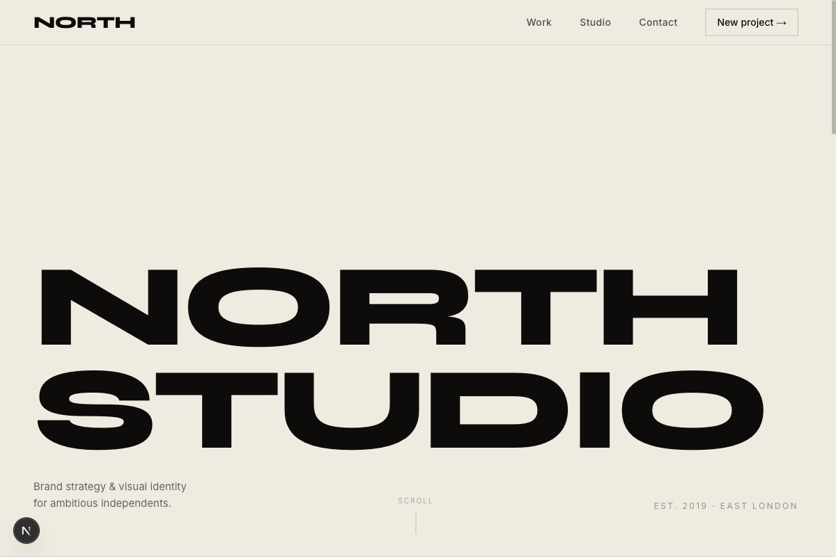
We let type do everything. The homepage opens with NORTH STUDIO at maximum scale in Syne, each word stamping up from below on load. Work is a list, not a grid — five client names at headline size, each with an industry tag, a year, and a yellow underline that draws itself on hover.
Each case study runs challenge → solution → outcomes with real numbers, set against a brand-colour system that gives every client their own accent. A custom cursor dot trails the pointer and scales over anything clickable — a small thing that makes the whole site feel hand-made.
Key Features
The warm parchment ground (#F0EBE1) with a single bold yellow accent keeps the site looking printed rather than rendered. Dark sections flip to near-black with the same typographic discipline.
Every animation is built on one easing curve and respects reduced motion. The case study data lives in one typed file, so adding a sixth client is a copy-paste job, not a development project.
Want results like these?
Let's talk about what we can build for your business. No obligation, just a conversation.
Start a project